
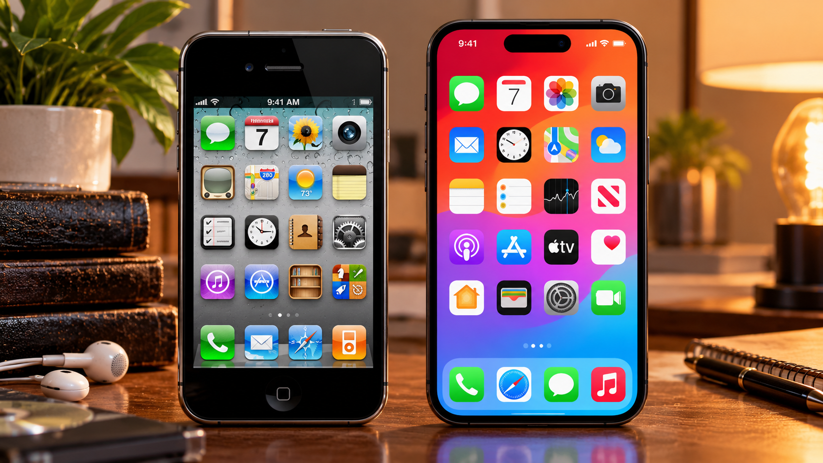
Open an early iPhone in your memory and the screen feels like a desk viewed from above. The Notes app is a yellow legal pad with ruled lines. The calendar looks like a page torn from a paper planner. A bookshelf made of polished wood holds your digital books, a stitched leather border frames your contacts, and a green felt table waits inside a games app as if a tiny casino had been folded into the phone. Nothing on that screen admits that it is made of light. Everything insists that it is made of something else. That style had a name that most users never heard until it was already disappearing, skeuomorphism, a long word for a simple idea. A digital object keeps the look of an older physical object so that people recognize what it is for. A trash can means delete because offices had trash cans. A floppy disk means save because saving once meant writing to a floppy disk. A notepad means notes because paper came first. Then, in a single update in 2013, Apple scraped the leather, the felt, and the wood grain off its phones, and the icons stopped pretending.
Why the First Phones Dressed Up as Desks
The disguise was not foolishness. When the first iPhone launched in 2007, the touchscreen was the strange part. Most people had pressed physical buttons all their lives, and a smooth sheet of glass gave no hint about where to push or what would happen next. Making a button look raised, shiny, and pressable answered a question that new users had not yet learned to ask out loud. Making a calendar resemble a calendar meant no manual was required for the first lesson. Apple leaned into that comfort with unusual enthusiasm. Steve Jobs favored the approach, and Scott Forstall, the senior vice president in charge of iOS software, became its most visible champion inside the company. Textures grew richer with each release. By the time iOS 6 and OS X Mountain Lion arrived around 2012, commentators were pointing at stitched leather, linen backgrounds, and wooden shelves as evidence that the imitation had become a habit, and in some corners a joke. The software on a milled aluminum device of remarkable restraint was decorated like a station wagon from another decade. Other designers followed, as designers tended to follow Apple. Materials that had no reason to exist on a screen, glass reflections on icons for apps that contained no glass, pages that curled for readers who had never asked for curling pages, spread across phones and websites. A metaphor that began as a courtesy to beginners hardened into a fashion, and fashion, once everyone wears it, starts to look like a uniform.
The Shakeup That Cleared the Desk
The turn came from a change in people before it came as a change in pixels. Forstall left Apple in the management shakeup of late 2012, following the troubled launch of Apple Maps and long reported clashes with other executives. Design chief Jony Ive, who had shaped the hardware and favored spare, industrial minimalism, took responsibility for the human interface work as well, uniting how the device looked with how its software behaved. At the Worldwide Developers Conference on June 10, 2013, Apple unveiled iOS 7, and the audience saw the most sweeping visual redesign the iPhone had ever received. The wood, felt, and leather were gone. Icons were redrawn as flat shapes in bright color, type thinned down, buttons lost their heavy shading and became simple text or fine outlines, and translucent layers floated over content with a soft blur, giving depth through stacking rather than through fake materials. Ive said at the time that people had become comfortable touching glass and no longer needed the physical world referenced so literally, a remark that Apple Insider and others have returned to often in retellings of the period. Reaction split immediately. Admirers called the new look clean, modern, and honest, a screen that finally admitted it was a screen. Critics called the early version of iOS 7 harsh, unfinished, and confusing, pointing at thin type that was hard to read and icons that looked, to some eyes, like they had been drawn for children. Forbes declared the death of skeuomorphism, and across the industry the obituary doubled as a starting gun. Google moved toward its own Material Design language in 2014, Microsoft had already bet on flat tiles with Windows Phone and Windows 8, and app makers everywhere flattened their icons, palettes, and buttons in the months that followed.
What Flat Design Gave, and What It Quietly Took
The case for flat design was never only about taste. Simpler visual elements could be easier to adapt across screen sizes that multiplied every year, and calmer to look at on devices people now consulted hundreds of times a day. A leather texture that charmed on one phone size could look muddy on another. A simple shape held up. As phones became the main computer for most of the world, that kind of adaptability stopped being a preference and started being infrastructure. Something was traded away in the exchange, and the argument about that trade has never really ended. Critics of pure flatness noticed that when every button loses its shading and every surface loses its shadow, people can have trouble telling what can be tapped from what is merely decoration. Designers began smuggling depth back in, a soft shadow here, a raised card there, until the flat era quietly admitted that human eyes like clues. Later styles with names like neumorphism tried, with mixed success, to push soft, extruded shapes back onto the screen, proof that the pendulum had energy in both directions. There is also the matter of memory. The old icons carried a shared visual vocabulary built over a century of desks, offices, and kitchens. A generation that has never mailed a film roll or wound a cassette still recognizes the envelopes, cameras, and reels those icons borrowed, yet the borrowing grows stranger every year. The floppy disk survives as the universal symbol for saving files among people who have never held one, which suggests that a skeuomorph, once learned, can outlive the object it copied by decades. Flat design did not erase that inheritance. It froze parts of it in place, simplified into glyphs whose origins grow more mysterious with each new class of first graders handed a tablet.
The Pendulum Never Really Stopped
Look closely at a current phone and the great war of 2013 reads less like a victory than like a truce. Icons are flat in outline but shaded with gentle gradients. Cards float with real shadows. Apples recent design languages play with translucency and light in ways that would have surprised the strictest flat era purists, while stopping well short of stitching digital leather onto anything. The materials are imaginary now, glass and glow rather than wood and felt, but they are materials all the same. Screens keep inventing substances because people keep reading substance as meaning. That may be the real story underneath the style fight. Skeuomorphism belonged to a moment when the digital world needed a passport from the physical one. Flat design belonged to the moment after, when the digital world felt established enough to travel on its own papers. Neither moment ended the human habit of asking an unfamiliar thing to resemble a familiar one. The habit only changed its costume, from a wooden bookshelf to a floating pane of frosted glass, and it will change again when the next unfamiliar surface, perhaps one worn on the face or projected into a room, needs to teach strangers where to look and what to touch. The icons on a home screen look modest, but they record that whole negotiation in miniature. A yellow pad became a white rectangle with lines, then lines alone, each step trusting the user a little more and explaining itself a little less. Whether that trust reads as progress or as loss depends on where a person started. Someone who learned touchscreens through stitched leather remembers a kindness in it. Someone who arrived later sees only clutter that mercifully cleared. Both are looking at the same small squares, and both, in their own way, are right.
Sources and references
- https://appleinsider.com/articles/22/08/23/what-apple-learned-from-skeuomorphism-and-why-it-still-matters?ref=blog.goosechase.com
- https://www.fastcompany.com/3016339/c_fit
- https://www.dezeen.com/2013/06/10/new-apple-ios-software-flat-design-jonathan-ive-wwdc/amp/
- https://techcrunch.com/2013/04/29/apples-jony-ive-said-to-be-bringing-the-flat-design-fad-to-ios-7-with-visual-overhaul/